Overview of features
The online documentary web-based interface will consist of a clean and simple layout with visually stimulating components that will hopefully prompt users to interact with the content.
Similar to the documentary Flawed (that I had analysed in Assessment 1), the simple layout will emphasise the interactive elements of the site and the stories to minimise distraction. It will consist of a straightforward navigation bar, social media buttons, user-generated content + submission forms as well as general feedback forms.
The main structure of the layout such as the header and the footer will be consistent and remain the same throughout the site. This will then allow users to access the different components of the project if they wish to jump between the different interactive components of the project platform.
Accessibility and usability will also play a significant role when the project begins to build. Font sizes and colours as well as site maps will be used to help those who need it and there will be notices or messages that will recommend how the project will be best viewed and interacted with.
Navigation
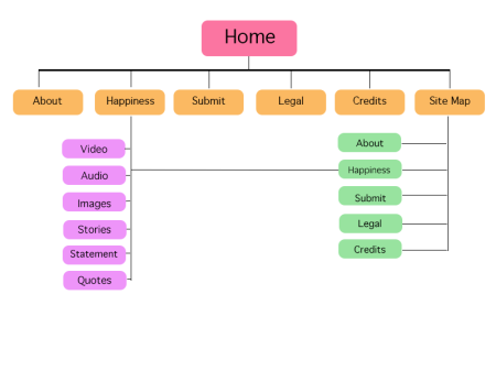
Navigation will be straightforward and simple. There will essentially be two; a main and primary navigation bar at the top which has all the links to the content through drop-down menus whilst the secondary navigation bar will be at the bottom, allowing users access to the site map, the ‘share to social media’ buttons and volume controls.
The sitemap will allow users to gain access to all the pages of content that are available and will be able to jump from one to another. As the documentary is not a traditional and linear project, this sitemap as well as the navigation will remove the need for bread-crumbing navigation usually seen on search engines and search results pages.
User Journey
The typical and general user (that is experiencing the project for the first time) will begin by landing on the home page (the introduction clip will play) to get a glimpse of what the documentary is about. From there, the user will then proceed towards the content page where it showcases the 6 highlighted interviews as well the user-submitted content. Users will be able to take a look around and interact with the content by reading, watching and listening to the content. They will also have the opportunity to submit their own and provide feedback on the project itself.
Layout
So the layout I have decided to implement will be one that is content and audience appropriate. As the target audience is a general and broad range, I thought that it would best be shown through a simple layout style that would allow for minimal distraction but still remain visually engaging.
Whilst i’m aware that the project should be usable on a variety of platforms, I have decided that the project based on the web platform will not be responsive as the content gallery is designed specifically for the web-based platform rather than personal media devices.
Home Page
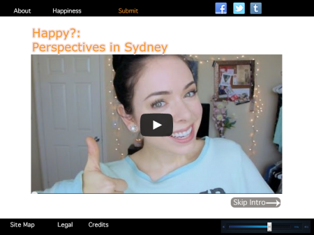
The home page will consist of the navigation bars and the introduction video. The video will basically consist of a teaser of some of the content and give the user a glimpse of what the project is about and what is install for them if they click through. Users will be able to skip the intro if they wish.
About/Credits Pages (General Pages)
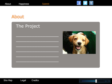
As you can see, these pages will be pretty simple. Its main purpose is to outline the information for each of those respective pages such as ‘About the project’ and ‘Credits’.
Content Pages
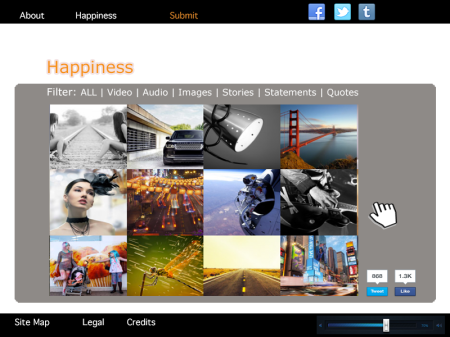
Essentially the content pages will be one of the main focus points of the project. It will show the main selected interviewees (the chosen 6 or so) and the rest of the space will be used to showcase the user-generated content. This will be shown as an interactive gallery or interactive tiles that will be animated if you hover over them or click on them.
I haven’t quite settled on which specific feature or function I will be implementing until functionality and time frame is allocated to the development of the project. The following will allow you to see the interactive ‘look’ and functionality that I will be going for:
- JavaScript 3D Cloud Gallery/Tags or 3D Image Cloud
- CSS3 Image Gallery
- Isotope Filters
- JQuery Visualisation Library
- Lightbox Gallery
The content (through implementation of one of those functionalities) will be categorised and users will be able to filter through the types of content submitted to the project. If these category filters are not active, users will have to scroll down through all the content if they so wish.
Ideally, I would love for the content to be able to be updated in real-time but this can cause considerable problems such as website crashes and I also lack the resources to do so.
Submission Page
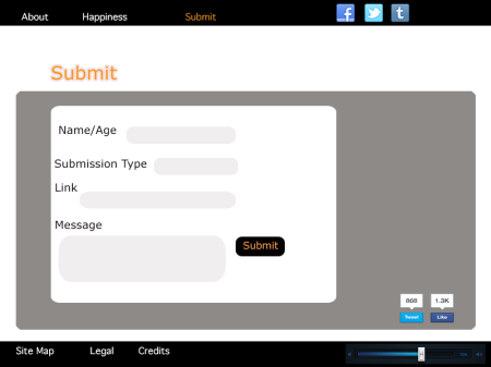
Similar to the general information pages, the form will essentially be a standard submission form.
Site Map
Quite similar to the general pages such as about & credits, the site map will consist of links to all the main pages within the project as well as the main categories that are listed in the contents section.
